
Travelling Transect · Theme reference
Style Guide
A visual reference for the black, terracotta red and grey theme. These examples show the current Divi variables and the fluid typography used on Home, En Route, Imprint and posts. Resize the browser to see the type and layout adapt.
01 · Color variables
Red marks links and actions. Charcoal carries headings, black anchors the navigation, and light greys create quiet surfaces. Green is reserved for colors naturally present in photographs.
White · #FFFFFF · Page and card surface. This introduction uses the White color variable.
Terracotta Red
#B14D38
Primary Color · Link Color
Black
#000000
Header · Footer
Charcoal
#1A1A1A
Heading Text Color
Dark Grey
#333333
Secondary Color · Body Text Color
Medium Grey
#666666
Secondary copy
Mid Grey
#B8B8B8
Decorative neutral
Pale Grey
#E0E0E0
Borders · Separators
Light Grey
#EEEEEE
Alternate surface
Off-white Grey
#F5F5F5
Soft section surface
Color names and roles
- Primary Color — #B14D38 · Accent and actions
- Secondary Color — #333333 · Secondary dark neutral
- Heading Text Color — #1A1A1A · Headings and charcoal title surfaces
- Body Text Color — #333333 · Main reading text
- Link Color — #B14D38 · Text links
- White — #FFFFFF · Page and card surfaces
- Black — #000000 · Header and footer
- Light Grey — #EEEEEE · Subtle alternate surface
- Dark Grey — #333333 · Alias of Secondary / Body
- Terracotta Red — #B14D38 · Alias of Primary / Link
- Medium Grey — #666666 · Secondary copy
- Pale Grey — #E0E0E0 · Borders and separators
- Off-white Grey — #F5F5F5 · Soft section surface
- Mid Grey — #B8B8B8 · Decorative neutral
- Charcoal — #1A1A1A · Alias of Heading Text Color
Variable logic: Primary Color, Link Color and Terracotta Red currently share one value. Secondary Color, Body Text Color and Dark Grey share one value. Heading Text Color and Charcoal share one value. Keep these aliases aligned when changing the palette; existing Divi references are preserved.
02 · Font variables
- Heading — Default · Inherited theme font for titles and headings
- Body — Default · Inherited theme font for reading text
No new font family has been introduced. Font sizes combine vw with rem minimums and maximums. This keeps text responsive while avoiding tiny text on phones or oversized type on wide screens. The fluid module presets use rem and vw instead of fixed pixel font sizes.
03 · Typography scale
- H1 · Heading 1 · H1 Size —
clamp(2rem, 1.3rem + 2.4vw, 4rem)· range 2–4rem · line height 1.15em - H2 · Heading 2 · H2 Size —
clamp(1.5rem, 1.1rem + 1.2vw, 2.5rem)· range 1.5–2.5rem · line height 1.25em - H3 · Heading 3 · H3 Size —
clamp(1.25rem, 1rem + 0.7vw, 1.875rem)· range 1.25–1.875rem · line height 1.3em - H4 · Heading 4 · H4 Size —
clamp(1.125rem, 0.95rem + 0.4vw, 1.5rem)· range 1.125–1.5rem · line height 1.35em
These four sizes are saved as Divi global Number variables and linked to the native Heading 1–4 presets. The live Heading modules below demonstrate the presets. Change the variable to update its linked preset. Each preset sets its matching semantic heading level.
- Title size —
clamp(2rem, 1.3rem + 2.4vw, 4rem)· Page and post titles - Heading size —
clamp(1.5rem, 1.1rem + 1.2vw, 2.5rem)· Section headings - Card title size —
clamp(1.375rem, 1.1rem + .7vw, 2rem)· Blog card titles - Body size —
clamp(1rem, .9rem + .35vw, 1.25rem)· Body copy and read more links - Small size —
clamp(.875rem, .8rem + .2vw, 1rem)· Post metadata
A method for looking closely
Reading the landscape together
Body example: the Travelling Transect connects observation, movement and interpretation. Comfortable line spacing and a restrained reading width support longer passages.
Metadata example · Research journal · 4 October 2026
04 · Divi font presets
Typography and Blog layout use native Divi variables and presets. Fluid sizes are defined once on Desktop and inherited on Tablet and Phone; old fixed viewport overrides have been removed. No active Theme Options custom CSS is needed for these settings.
- Body Text · Text 1 — Body Size · line height 1.7em · Body weight Regular (400)
- Heading 1–4 — Matching H1–H4 Size variables and semantic levels · line heights shown above
- Title Text · Text 1 — Inherits the size from each Heading module preset
- Heading Text · Font Header 1 — Text module H1–H4 use their matching Size variables and line heights
- Post Title Preset 1 · title — H1 Size · line height 1.15em · no text shadow
- Post Title Preset 1 · meta — Small Size · line height 1.5em
- Blog Preset 1 · title — Card Title Size · line height 1.25em · Body weight
- Blog Preset 1 · body — Body Size · line height 1.7em
- Blog Preset 1 · meta — Small Size · line height 1.5em
- Blog Preset 1 · read more / pagination — Body Size · line height 1.4em · Body weight
- Button · Text Button — Body Size and Body weight
Weight logic: Reading text and links use Body Regular (400). Blog title links, read more, pagination and text buttons are bound to the global Body weight. Unlinked headings use Headings Medium (500). Text links inherit their surrounding Body weight.
05 · Layout and surfaces
Space token: clamp(1.25rem, 1rem + 1vw, 2.5rem). The native Blog Grid uses two equal columns on Desktop and one column at Divi’s Tablet and Phone breakpoints (980px and below). Both gaps are linked to Fluid Space. Cards use white backgrounds and pale grey borders. En Route uses a charcoal title on a plain white surface.
06 · Other Divi variable categories
- Gradients — No global variables · Use solid surfaces for titles
- Images — No global variables · Photography remains content-specific
- Links — No global variables · Navigation uses the existing WordPress menus
- Numbers — H1 Size, H2 Size, H3 Size, H4 Size, Body Size, Small Size, Card Title Size and Fluid Space are saved in the Divi Variable Manager. The Heading, Body Text, Heading Text, Post Title, Blog and Button presets use the matching variables. Blog Grid gaps use Fluid Space.
- Text — No global variables · Editorial text remains in each page or post
07 · Consistency checks
- Titles have a clear hierarchy and readable contrast.
- Text links use terracotta red and the same weight as Body; navigation and text buttons retain their neutral palette.
- Blog cards become a single readable column on phones.
- Font sizes scale with the viewport and retain a readable minimum.
- Legal copy is preserved; only its presentation is adjusted.
Home · En Route · Imprint · Test 2
Theme reference · 5 October 2026. Variable values and native presets are documented above. The modules below demonstrate the shared settings, including Body-weight links.
08 · Divi Modules Examples
Style Guide
Blog Module
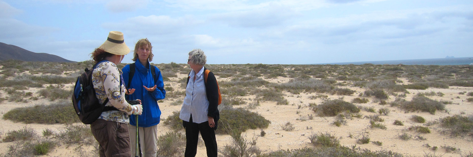
Blog Post Test
Alicimus con reicitio eatemquae ipiet ex et, te porion conetus acilica turionsedi cus, nullendit od qui quo dolenita pelitia que pro beaquid eseque et aut veliat doloreici il et venihilit ea aspitatiis rem illabo. Nam non con nostibus dollecatur, nis ant quibus unt...
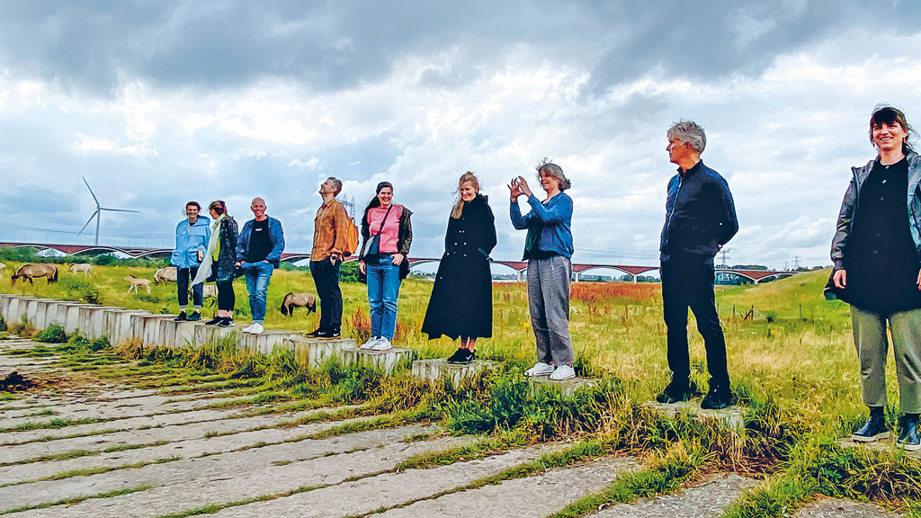
Test 1
sdvsdvadvsdv s fvs dvsdf bbdf sdvdsvsdv d w WVBWrbwrb w rbwrbrwb
Heading 1
Heading 2
Heading 3
Heading 4
A method for looking closely
Reading the landscape together
Body example: the Travelling Transect connects observation, movement and interpretation. Comfortable line spacing and a restrained reading width support longer passages.
Metadata example · Research journal · 4 October 2026